Interaction Design Reflections: Wireframes
This week, we performed an iterative wireframe exercise in order to flesh out the navigation architecture for our imaginary mobile app.
Sketch first, ask questions later
We did sketches with plain old pen and paper, then posted them to a student group forum for peer review.
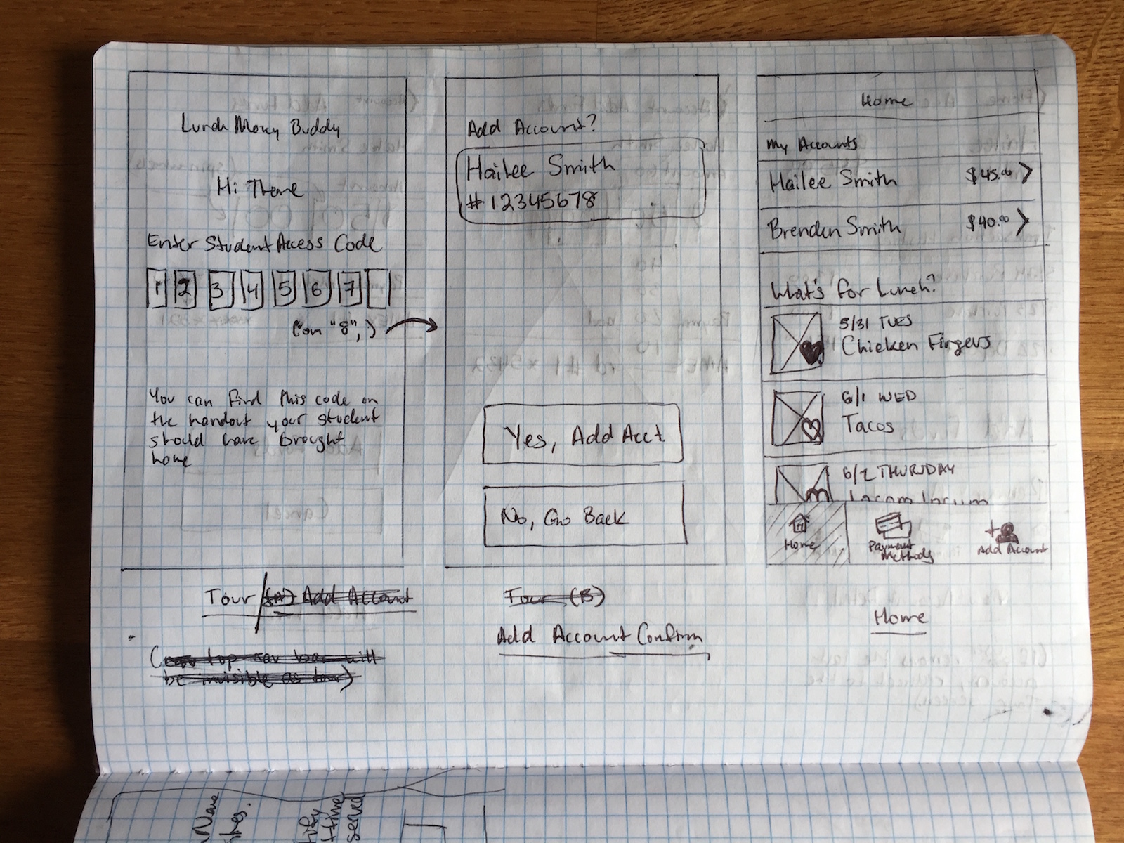
Despite my atrocious chickenscratch, I received generally positive feedback with a few suggestions identifying conceptual problems related to the lower navigation bar.
Navigation elements interfere with discrete activities
On your “Account” wireframe, do you think that the tray navigation is necessary there? Could it distract the user from adding funds and potentially have them abandon and not make a payment?
Here was the first major problem. The activities Add Account, Add Funds to Account and Add Payment Method are all discrete activities with definitive outcomes (e.g., Save or Cancel, Remove or Cancel, etc), but I had kept navigation elements (i.e., lower tab bar and the &lgt; Back buttons) present on those screens. At best, those components only clutter up the UI; at worst, they’d present huge vectors for user error and confusion.
I went with the suggestion of modalizing (probably not a word) those activities.
Top-level navigation elements to activities that will not be used often
ADD ACCOUNT: Again I think the process here is good, but it should not be part of the main nav because once your kids are entered you will have no further use for it.
This one actually made me laugh once I thought about it. Here’s this button that you will literally never need again if you’ve only got the one child in school right there at the bottom of the app. Ever-present. Mocking you. Judging you. All because you can never use it again.
I fixed this one by restructuring the architecture around three key areas: Home, Accounts and Payment Methods. Incidentally, those ended up being the three navigation buttons on the lower nav.
The Takeaway
Spent a lot of time with proto.io this weekend
Because last week led up to a holiday, the schedule was relatively light—I was actually able to play around with proto.io this time. As it turns out, it’s pretty frickin sweet. Who knew?
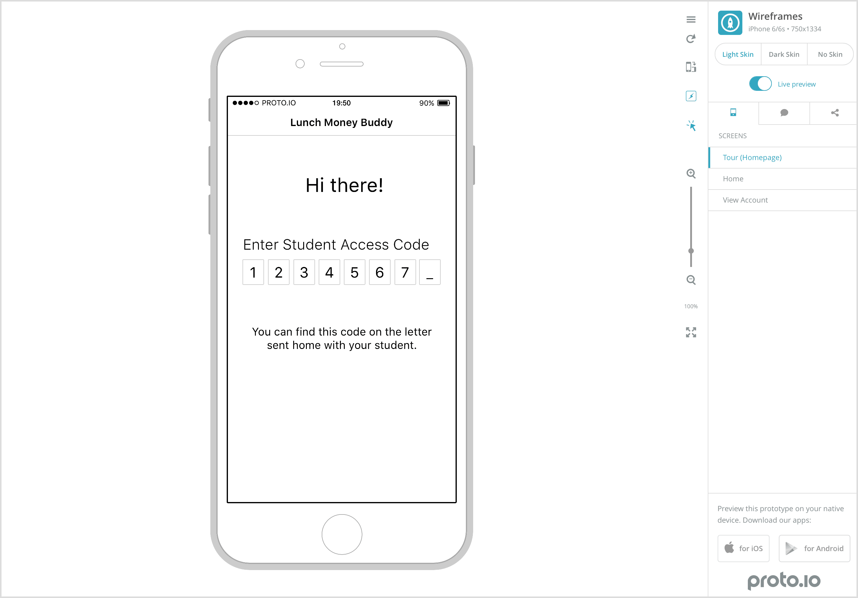
My crappy screenshots that don’t really do it justice…
You can create an interactive prototype (composing transitions, state changes, animations, etc.) that responds to user inputs and covers most major mobile interface design languages (e.g., iOS, Material Design, etc). It’s not unlike XCode’s Storyboard functionality except cross-platform and without the $1300 cover charge.
Proto.io does have its flaws
Granted, there are some quirks about the interface that bug me. For example, double-clicking on an element that contains text won’t actually select the text inside of it. The required interaction is:
- Double click element.
- Wait half a second.
- Double click again.
- Crap, didn’t work. Pause for another half second.
- Double click.
- Still nothing.
- Click furiously until something happens.
Also, if you turn off Snap to grid (because it’s just too damn aggressive), Shift+Up|Down|Left|Right will shift selected elements by Infinity. Let that percolate in your mind for a moment…
But considering the functionality packed into it, I’m inclined to just live with those complaints.
Attachments
![]()