Interaction Design Reflections: Interactive Prototypes (Redux)
This week, we refine the prototypes we built last week based on peer feedback.
Putting the “iterative” in “interactive”
Get it? Because one word is a subset of the other! …I’ll let myself out…
Based on the feedback I got from my peer group last week, I noted and attempted to correct a number of deficiencies.
TL;DR, I’ll spare you the boring details and offer the link to the updated version up front:
Users need more information regarding auto-refill (how often does it occur, how much is refilled, is there a balance trigger, etc)
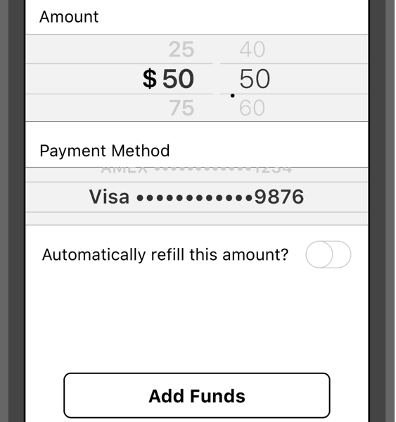 I addressed this by adding a more descriptive label to the toggle button that reveals a trigger balance field beneath it:
The initial value for that field should ideally be rounded to the current balance of the account as a convenience.
My intent here was to keep the “simple” path clean for the non-technical persona (who just wants to open the app, add funds and not be bothered by anything else), while providing enhanced options for interested parties.
Users have no way to view a list of things they’ve “favorited”
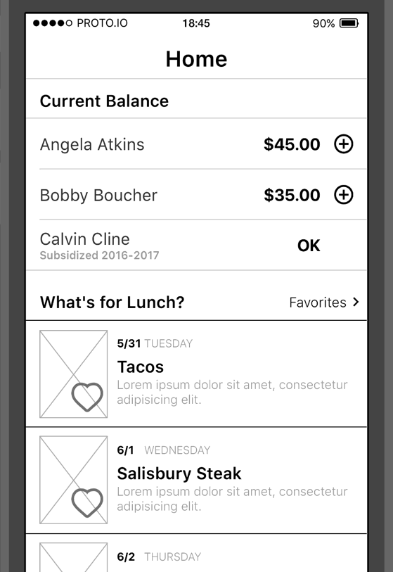 This I solved by just adding another screen since it’d be pretty hard to piggy back this onto something else.
This view lists everything the user has “favorited” (which, according to Oxford, is a verb) and affords the ability to “unfavorite” (which sadly, as of 2016-06-13, hasn’t yet made the cut.
And even better, it doesn’t obstruct the “simple” path my non-technical persona needs while at the same time providing an enhanced experience for interested parties.