Interaction Design Reflections: Interactive Prototypes
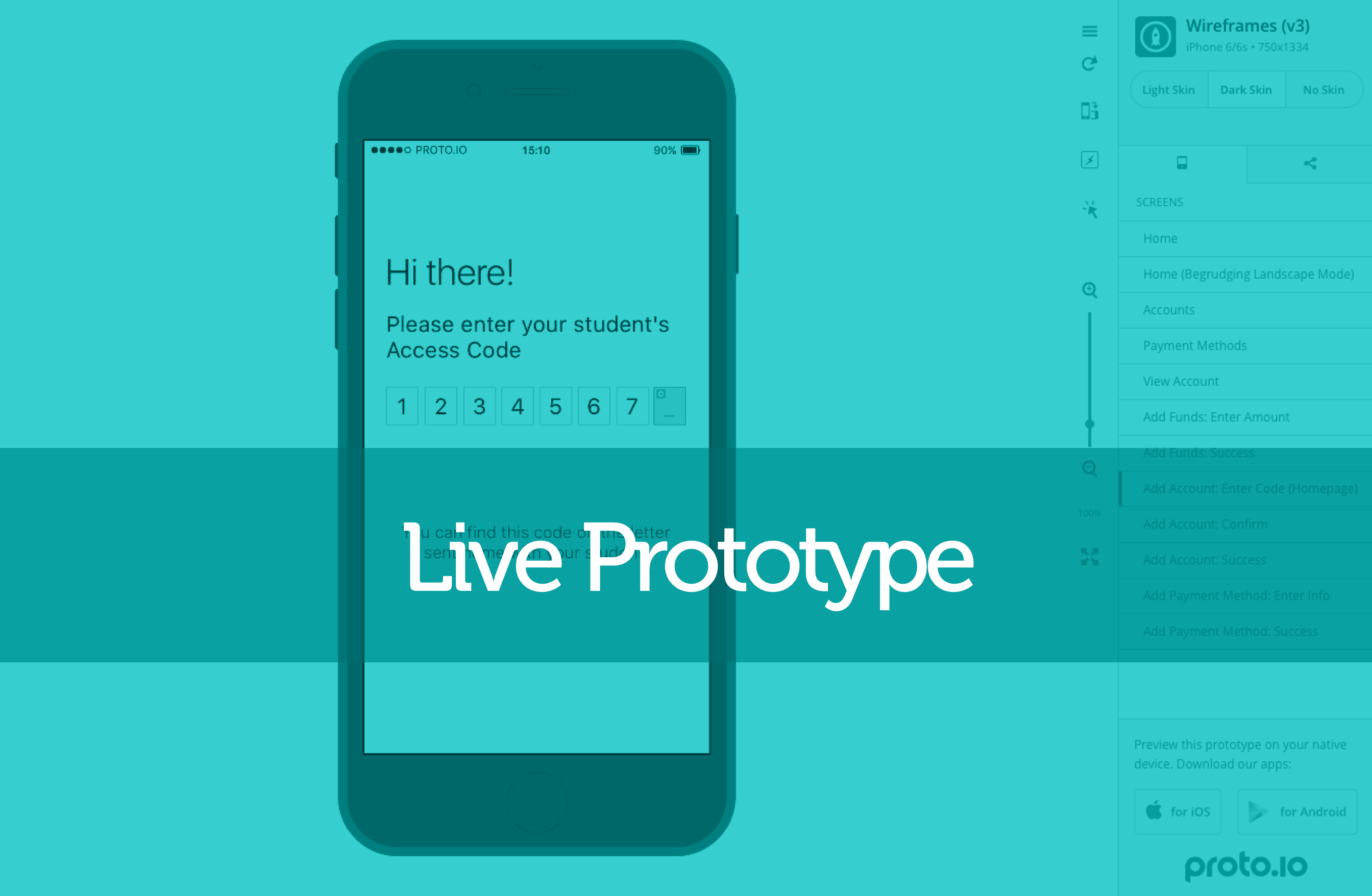
This week involved building out a fully-interactive prototype of the project mobile app, showing off our designed user journeys and planned interactions.
Full disclosure: I actually finished this assignment last weekend
This is what I spent last weekend doing (and incidentally how I got more familiar with proto.io)—gold-plating, err, crafting the entire interactive wireframe. Which is probably a good thing, considering the hair-fire mid-sprint demo dropped on me at work this week.
The Takeaway
Phrase of the day: glaring oversight
Stepped into this week feeling pretty confident about that prototype. Thankfully, I was humbled rather quickly by: (a) one of my classmates prototype being much prettier than mine; and (b) someone pointing out several missing screens, such as the ability to list “favorited” meals and details around the Auto-refill mechanisms.
I always feel weird critiquing other’s work
Let’s go ask for Dave’s opinion about this… no one, ever
As if I know what I’m talking about, ha. Plus, I know how defensive I can be about my own work, so I try to keep that in mind before I go poking holes in the work of others. Sometimes I wonder if that makes me hold back on criticism if I feel there may be too much to complain about.
It’s also weird because the critiquing for this assignment may appear retaliatory (feedback is async; you can view someone’s feedback before giving your own). It kinda makes me hold back a bit more if I’m reviewing someone who dinged me on some things, lest it look as if I’m trying to get even.

